Bowtie Diagrams: The 5 ‘W’s
What is a bowtie diagram? Who is it made for? When is it used and where? And why bowtie diagrams? Keep reading to find the answers to all of your bowtie diagram questions.

What is a bowtie diagram?
A bowtie diagram is a picture of a risk scenario that shows you what could go wrong and how you’re prepared to handle it. But a bowtie diagram is so much more; it’s a comprehensive roadmap that walks you through the potential hazards and the barriers you have in place within your organisation.
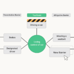
At the centre of the bowtie diagram are our hazard and top event. A hazard is an operation, activity or material that you are trying to control, and the top event is what occurs if you lose control of the hazard. On the right side of the diagram, you’ll find the unwanted outcomes, or consequences, that may result from the top event. On the left side are the threats. Threats are the first dominoes we need to prevent from falling and leading to the top event.
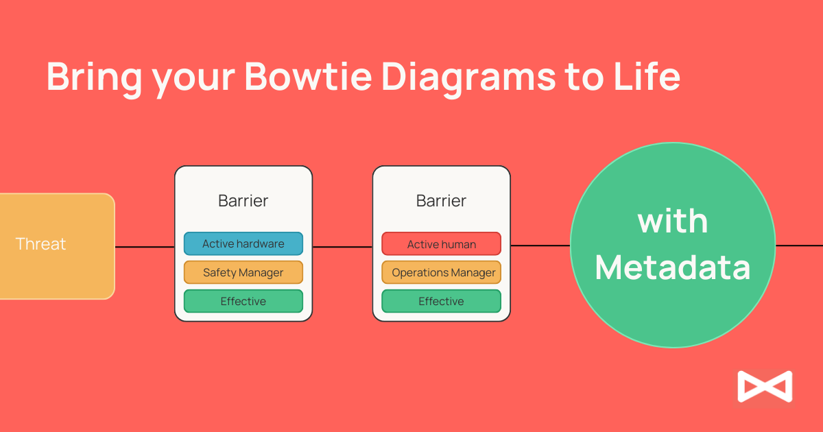
But bowtie diagrams aren’t just about highlighting doom and gloom. They’re about solutions, which is where barriers come into play. Barriers are your lines of defence against the top event. They are the measures you put in place to either prevent the top event from happening or mitigate its consequences if it does occur. Barriers are crucial because they represent the actionable part of your risk management strategy. They are the steps you take to ensure safety and reduce risk.
If you want a more detailed description of each elements and its role in a bowtie diagram, head over to our blog, Introducing the 7 Elements of a Bowtie Diagram.
The structure of these elements – threats and consequences branching out from the top event in the middle – is what gives the bowtie diagram its distinctive shape and name. It’s a visual representation that’s both simple and in-depth, helping you see at a glance the risks you face and the measures you’ve taken to control them. Bowtie diagrams are a valuable tool for anyone involved in risk management, offering clarity, insight, and direction in navigating the complex landscape of organisational risks.
Who is a bowtie diagram made by and for?
The versatility of bowtie diagrams is a great thing when creating and sharing your diagrams. They can be made extremely simple, with just a few threat and consequence pathways. Or, they can be elaborated upon, with multiple barriers for each threat and consequence, extra details such as metadata and risk matrices, and more. What we mean to say is that bowtie diagrams are for everyone.

Who can make a bowtie diagram?
We’re not trying to say that bowtie diagrams should be a new subject in school – but what we are saying is that any risk management professional, junior or senior, can incorporate bowtie diagrams into their risk management strategy. A well-constructed bowtie diagram is a collaborative effort, taking into account the perspectives from those who work closely with the barriers and who are familiar with the risk scenario.
Who is a bowtie diagram for?
Due to their versatile nature, bowtie diagrams can be made for pretty much anyone. They are incredibly effective in communicating risk-related information to a wide range of stakeholders, including senior management, who may need to make informed decisions based on these risks. The clarity and simplicity of bowtie diagrams also make them suitable for presenting complex information to a non-expert audience, such as auditors, regulators, or even the general public in contexts like building safety or environmental hazards.
When should you make a bowtie diagram?
It’s always a good idea to have a few ready-made bowtie diagrams on hand for when you need to effectively communicate risks. However, there are a few specific instances where creating bowtie diagrams are especially useful. One of the key instances when you should develop a bowtie diagram is during ALARP reviews. ALARP stands for ‘As Low As Reasonably Practicable’, and is a principle used to ensure that risks are reduced to a level that is both manageable and acceptable. Bowtie diagrams can serve to prove whether we’re doing enough to prevent or mitigate risk.
Another significant occasion to turn to bowtie diagrams is during the onboarding of new employees. Introducing them to the organisation’s risk landscape through a bowtie can be both engaging and informative. It provides a clear and concise communications of the potential risks they might encounter in their new roles and the measures in place to manage these risks. It also ensures accountability if these employees play a role in the maintenance of your barriers.
As mentioned above, bowtie diagrams are particularly useful when presenting complex risk scenarios to decision-makers. Their ability to distil information into an easily digestible format makes them invaluable in strategic discussions and decision-making processes. Whether it’s for justifying budget allocations for safety measures or strategizing for future risk management plans, bowtie diagrams can effectively communicate the necessary information in a format that is both concise and easily understood.
Why bowtie diagrams?
We don’t want to beat a dead horse, but bowtie diagrams are an excellent visualisation tool. You know that by now. You also know that bowtie diagrams are easy to make and easy to understand. They’re collaborative and totally customisable to your organisation’s needs.
Now that we’ve covered the why, let’s move onto where and how you can make them!
Where can you make a bowtie diagram?
Glad you asked! Bowtie Master is easy to use, cloud-based software. It’s totally customisable to your needs, so it will fit into your risk management strategy no problem. Here are a few of the benefits of Bowtie Master:
- Drag and drop elements into place
- Access whenever, wherever
- Unlimited users; unlimited diagrams
- Built-in dashboard (or, connect to other software dashboards)
- Customisable to your needs (risk matrices, metadata, you name it)

Not ready to take the leap? No problem! Get started using our free Excel and PowerPoint templates. It’s also recommended to make bowtie diagrams collaboratively, in a workshop environment.
Questions? Send us a message at support@salus-suite.com.
Conclusion
Bowtie diagrams are more than just a tool; they’re a lens through which we can view and manage risks effectively. Whether you’re a seasoned risk management professional or a newcomer to the field, these diagrams provide a clear, comprehensive, and customisable way to understand and communicate risk scenarios. Bowtie diagrams are not just about identifying risks; they’re about fostering a culture of safety and awareness, empowering an entire workforce to participate actively in risk mitigation. By incorporating bowtie diagrams into your strategy, you’re not just documenting risks, you’re actively engaging with them, making your environment safer and more resilient. Managing risk is a responsibility that we all share, and bowtie diagrams are a powerful tool in doing so.